

Testing for the iPhone Duo: What QA engineers need to know now that the iPhone folds

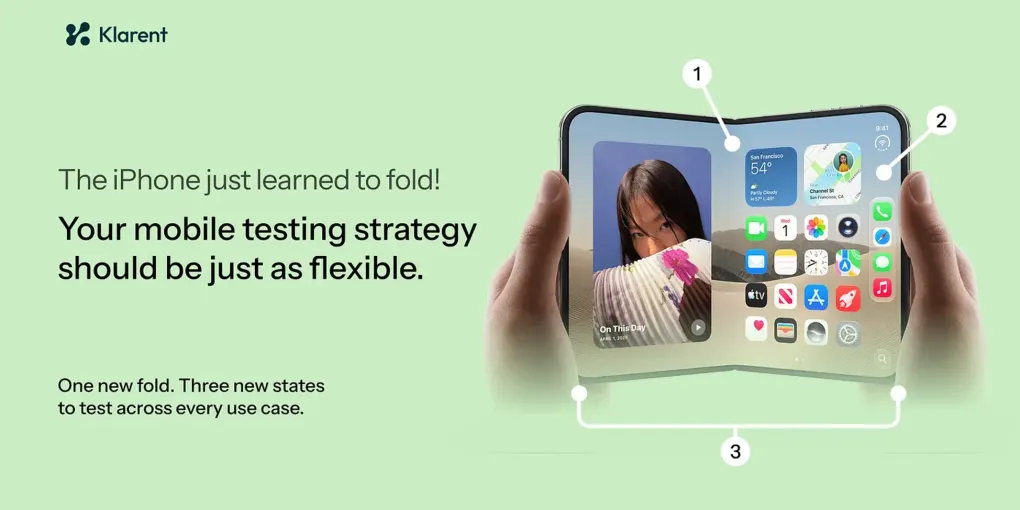
For nearly two decades, one assumption sat quietly underneath almost every iOS app ever shipped: the screen is a fixed rectangle. It might rotate. It comes in a handful of sizes. But while your app is running, it does not physically change shape.
Apple unveiled the iPhone Duo on September 9, 2026, its first foldable iPhone. It is a book-style device: a 5.4-inch outer display that unfolds into a 7.6-inch inner display, powered by the A20 Pro chip and shipping on iOS 27. The marketing story is the hardware. The engineering story, and specifically the QA story, is that a screen can now grow, shrink, and re-lay-out mid-session, and your app has to survive every frame of that transition.
Foldables have been an Android reality for years. Samsung’s Z Fold and Z Flip lines, Google’s Pixel Fold, and others taught mobile teams what a resizable device does to an app. What changed on September 9 is that the single largest, most homogeneous app ecosystem in the world, iOS, just inherited the same problem. If your team ships an iPhone app, this is now your problem too.
A foldable iPhone isn’t a design story. It’s a test coverage story. Here’s why.
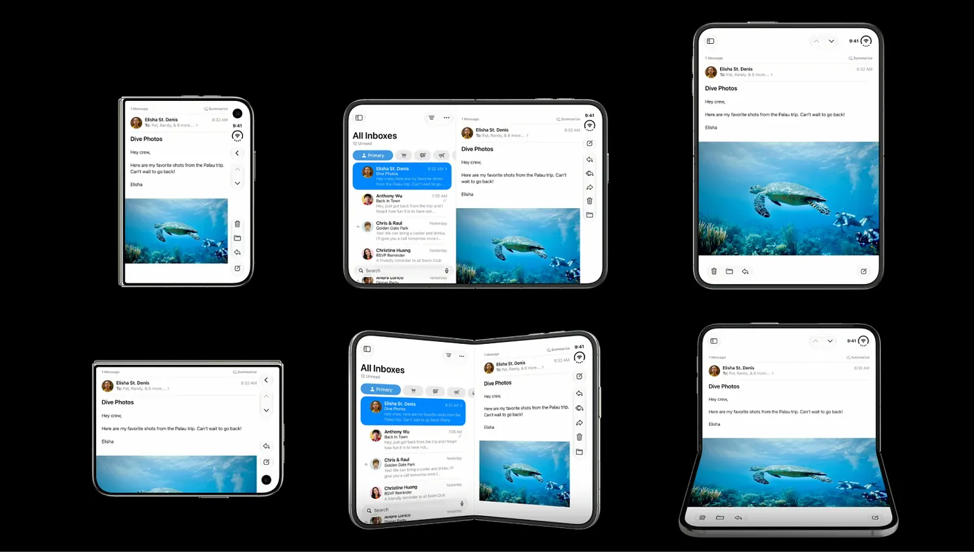 Foldable states in iPhone Duo
The new test matrix: it’s not one more device
QA leaders are used to thinking in device counts. Add a phone, add a row to the grid. The Duo doesn’t work like that. It adds dimensions, and dimensions multiply. Consider what you now have to exercise for every meaningful user flow:
- Poses: closed (outer display), open (inner display), rotated, and the fold/unfold transition itself.
- Displays: outer and inner, which report different size classes and have different safe areas.
- Multitasking states: full screen, Split View (tiled and overlay), and side-by-side apps on the inner display.
- Continuity paths: start a task on one display, change pose, and confirm the task survives, in both directions.
- SDK levels: legacy, iOS 27, and iOS 27.1 builds behave differently.
One “add a device” line item on a roadmap is really a combinatorial expansion of states across every screen in your app. For a two-person QA function, or a team where developers own their own tests, that expansion doesn’t get absorbed quietly. It shows up as either slipped coverage or slipped dates.
What actually changed under the hood
Before the pain points, the mechanics, because you can’t test what you don’t understand.
Two displays, one aspect ratio. The inner display is 1878 x 2670 pixels; the outer is 1398 x 2034. Both run at 120Hz ProMotion with an always-on mode and up to 3,000 nits of peak brightness. Critically, Apple designed both panels to share roughly the same aspect ratio (about 1.43:1), so content scales proportionally as the device opens and closes rather than being re-cropped. That sounds like a gift to testers. It isn’t quite, because “scales proportionally” and “lays out identically” are two very different things.
The screen changes shape while your app is running. Fold and unfold are runtime events. Your view hierarchy re-lays-out live. Any code that captured a dimension once at launch, any hardcoded frame, any layout that assumed a stable width, is now a latent defect waiting for a user to open the device mid-task.
The safe area is no longer symmetric. The inner display carries an under-display FaceTime camera and new reserved regions. Layouts that assumed symmetric insets, a very common shortcut, can now collide with system UI or leave content stranded.
Orientation logic is officially obsolete. Apple’s guidance is blunt: the inner display doesn’t honor supported-orientation settings the way older iPhones did. Teams are told to replace interface-orientation checks with size-class checks. Any test that asserts on orientation-driven behavior is testing a model of the world that no longer holds.
There’s an SDK ladder, and behavior depends on which rung you’re on. This is a subtle trap for QA. The same app binary behaves differently depending on the SDK it was built against:
- Built against a pre-iOS-27 SDK: the app runs at a familiar, letterboxed size on the inner display. It works, but it doesn’t use the new space.
- Built against the iOS 27 SDK: the app extends further across the inner display.
- Built against the iOS 27.1 SDK: the app reaches the full screen edge, and standard navigation and toolbar controls re-flow vertically under the status bar.
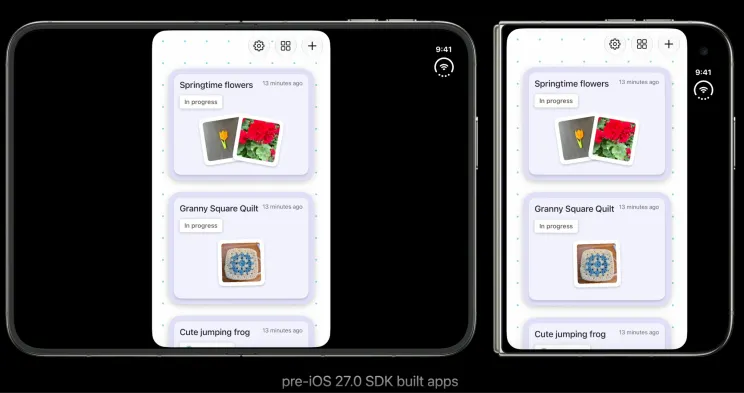 Built against a pre-iOS-27 SDK
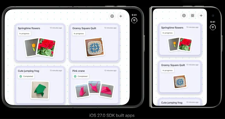 Built against the iOS 27 SDK
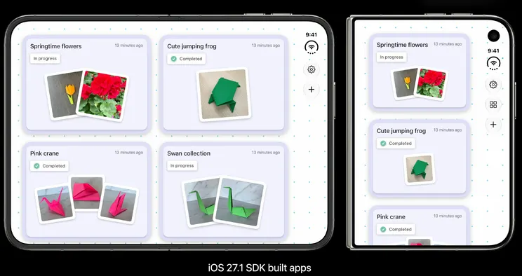 Built against the iOS 27.1 SDK
That means “does the app look right on the Duo?” has no single answer. It depends on the build. Your test plan has to account for the SDK level as an explicit variable, not an afterthought.
New adaptive APIs, new behaviors to verify. Apple shipped ArrangementView for two-related-view layouts, ReservedRegion / UIViewReservedRegion (iOS 27.1) for edge-to-edge custom UI that avoids system elements, and Concentricity APIs for corner shapes. Split View behavior is now pose-dependent: closed, columns collapse to single-stack navigation; open, they appear tiled and as overlays. Each of these is a new surface to validate.
The pain points QA engineers will feel first
This is the part that matters when the device is actually live in users’ hands. Here is where teams get hurt, in roughly the order they’ll notice.
Your selectors and coordinates break the moment the screen re-lays-out
Most mobile UI automation is coupled, one way or another, to where an element is or how it’s addressed in a specific view hierarchy. Coordinate-based taps, index-based selectors, and brittle accessibility-path lookups all assume the layout is stable. On a foldable, it isn’t. When the device unfolds, the hierarchy reflows, columns tile, navigation re-arranges, and the element your script was reaching for is now in a different place, at a different index, inside a different container.
Automation vendors are already explicit about this: static coordinates for element location are unreliable on devices that dynamically change screen size. The practical result is a wave of “flaky” test failures that aren’t flaky at all. They’re your suite correctly reporting that it was written for a screen that no longer exists.
State and continuity bugs are the hardest to catch and the worst to ship
The signature foldable defect is lost context across a transition. A user is halfway through a form on the outer display, unfolds the device, and the form clears. A video restarts instead of resuming. Scroll position jumps to the top. An in-progress upload dies. These are not layout cosmetics, they are trust-destroying data-loss bugs, and they only appear at the seam between two states, which is exactly the seam traditional test scripts rarely cross.
Testing continuity properly means driving the transition itself, then asserting that scroll position, form input, media playback, and in-flight operations all survive, in both fold directions. Most existing iOS suites have no such assertions because, until now, there was no transition to test.
Layout breakage: overlap, clipping, and dead space
The friendly version of a foldable bug is visual. Elements overlap or get clipped after a pose change. Content that filled the outer display leaves a sea of dead space on the inner one because it was centered for a phone, not composed for a canvas. Custom bars collide with the asymmetric safe area or the under-display camera region. Split View exposes half-width layouts and asymmetric insets, which is precisely where most layout bugs concentrate. None of these throw an exception. A pass/fail assertion won’t catch them. They need visual validation across every pose.
The simulator will lie to you
Apple did ship help here: Xcode 27.1 includes an iPhone Duo simulator in DeviceHub, with on-screen controls to open, close, rotate, and fold the device so you can check layouts in every pose. Use it, it’s genuinely useful during development. But it is not sign-off. Real hinge behavior, real touch and gesture handling during a physical fold, real transition timing, and Apple Pencil support (arriving later) only surface on hardware. A layout that passes cleanly in the simulator can still feel janky, drop a frame, or lose state on a real device mid-fold. “It worked in the simulator” is going to be a recurring line in a lot of bug post-mortems this fall.
There are no devices to test on, right when you need them most
Here’s the acute, time-boxed pain: the Duo goes on sale October 23, in limited initial supply, at $1,999 a unit. Cloud device farms won’t have broad Duo availability at launch, and buying a rack of first-generation foldables is neither cheap nor instant. So in the exact window when users are folding your app for the first time and filing one-star reviews, most teams will have little or no real hardware to reproduce issues on. Physical foldable access has always been the expensive, scarce part of foldable QA. The Duo concentrates that scarcity into the highest-stakes weeks.
Every existing iOS suite just took on maintenance debt overnight
This is the quiet one. Nothing in your current suite failed today. But every automated flow you own now has an unstated gap: it doesn’t cover the new poses, and some of it will start failing as soon as you refactor layouts for the Duo. The work of extending coverage to fold/unfold, Split View, and both displays lands on the same headcount that was already fully booked. Foldable readiness isn’t a feature you add. It’s a tax on everything you’ve already automated.
Fixing the Duo can regress the phones you already support
Because the migration path touches shared layout code, replacing orientation checks with size classes, removing UIRequiresFullScreen, moving to NavigationSplitView, the changes ripple back to iPhones and iPads already in your matrix. So the regression surface isn’t just the new device. It’s your whole supported fleet, retested against modified layout logic. Coverage that used to be “done” is now in scope again.
Why traditional test automation struggles here specifically
Step back and the common thread is coupling. Scripted mobile automation tends to bind tests to the implementation of a screen, its coordinates, its hierarchy, its element indices, rather than to the intent of a flow. That coupling was tolerable when the implementation was stable. On a device whose implementation literally reshapes itself at runtime, and across an SDK ladder where the same binary lays out three different ways, that coupling becomes the primary source of failure and the primary source of maintenance.
You can absolutely brute-force it: write a script per pose, per display, per SDK level, add explicit waits around every transition, and re-record everything each time the layout shifts. Plenty of teams will. But that path scales headcount linearly with the state explosion described above, and it front-loads all the cost onto the smallest, most constrained function in the org.
The path forward: tests that adapt instead of tests that shatter
The durable answer to a screen that changes shape is a test layer that doesn’t assume the screen stays still.
That’s the core idea behind agentic, AI-driven QA, and it maps almost one-to-one onto the pain points above:
Self-healing element location. Instead of binding to coordinates or a fixed hierarchy path, resilient tests locate elements semantically, by role, label, and intent, so when a fold reflows the layout and shifts the view hierarchy, the test re-locates its target and keeps running instead of throwing a false failure. This is the single biggest lever against the “flaky after unfold” flood, and it’s where teams report the steepest drop in maintenance effort.
Goal-driven exploration across poses. An AI agent that understands a flow’s intent can exercise that flow across closed, open, rotated, and Split View states without a human hand-writing and hand-maintaining a separate script for each combination. The state explosion stops being a headcount problem.
Continuity as a first-class assertion. Because the agent drives the transition itself and evaluates the resulting state, “does context survive the fold?” becomes something you can check systematically, rather than a manual spot-check nobody has time for.
Plain-language flows over brittle scripts. Describing a flow in intent terms and letting the system generate and adapt the underlying automation means the fold/unfold handling, waits, and re-location logic are the tool’s job, not a maintenance burden you carry.
This is the lane Klarent is built for. Klarent is an agentic QA platform for web, iOS, and Android, with self-healing tests that adapt when the view hierarchy shifts, exactly the failure mode a foldable introduces on every transition. The Duo doesn’t create a new category of testing problem so much as it makes an existing one impossible to ignore: apps have been getting more dynamic for years, and coordinate-bound scripts have been quietly rotting the whole time. A screen that folds just made the rot visible in a single hardware launch.
What to do before October 23
A practical, order-of-operations checklist:
- Inventory the assumptions. Grep for hardcoded frames,
UIScreen.main, orientation checks, andUIRequiresFullScreen. These are your highest-probability defects. - Add the SDK level to your test plan as an explicit variable. Decide which rung you’re shipping on, and test that build, not a hypothetical one.
- Write continuity assertions now. For your top flows, add checks that scroll position, form state, media, and in-flight operations survive a pose change in both directions.
- Use the DeviceHub simulator for breadth, reserve real hardware for sign-off. Simulate all four poses on every screen, plan for scarce physical devices in the launch window, and prioritize accordingly.
- Stop binding tests to coordinates and indices. Move toward semantic, self-healing element location so a reflow doesn’t read as a failure.
- Re-run your existing fleet against the refactor. Treat Duo migration as a regression event for every iPhone and iPad you already support, not just the new device.
The takeaway
The teams that handle the Duo well won’t be the ones that added a device to a grid. They’ll be the ones whose tests describe what the app should do rather than exactly where to tap, so that when the screen changes shape, the test adapts instead of shattering.
The iPhone just learned to fold. The question for every mobile QA team is whether their testing is flexible enough to fold with it.
If your team is staring down a Duo migration and wants a second pair of agentic eyes on it, contact us and we’ll show you how Klarent adapts as the screen does.